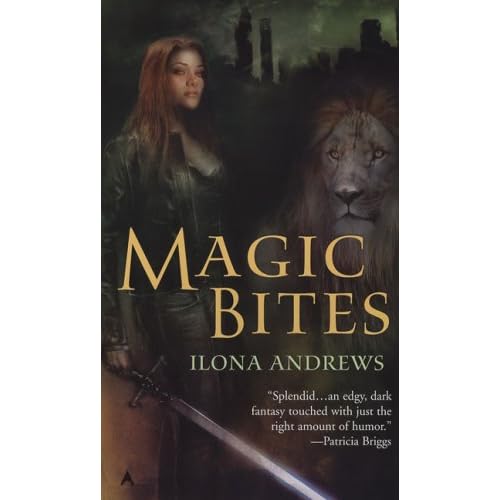
 Quite seriously, I just woke up 10mins ago, so I'm not all that awake and will no doubt have more opinion on it when I am awake. I like Curran (the lion for those who don't read the series - and if you don't, do it's awesome), but I'm not convinced about 'Kate'. She doesn't look ready to use that sword to me, simply that she's holding it trying to look tough. Which is what she is doing... I do like the font for the title though! Curious to see how the Magic Burns, Strikes and Bleeds covers come out now. Anyone else have an opinion? Oh and for comparison (if you're interested) this is the US cover for it:
I prefer Kate on this cover, she looks more like how I see Kate in the books. And I do prefer seeing an actual lion as Curran. But the UK version of Curran is pretty cool too. And we get a cooler title. Not sure which I like best now either.

No comments:
Post a Comment